Business Card Printing in Riyadh: Stock, Finish and Turnaround Explained
Every specification choice on a business card, in plain language — and what each one actually changes about the card in someone’s hand.
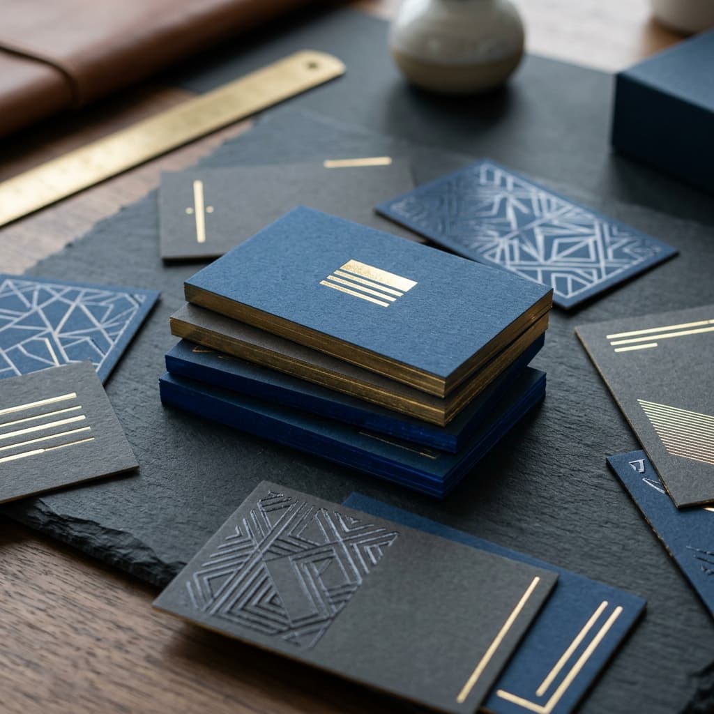
A business card is the only thing you print that gets handed directly from your fingers to someone else’s. That makes it the one print product where the physical properties matter as much as the design. Weight is registered before the name is read. A card that flexes when it is taken out of a wallet reads as cheap regardless of how good the logo is.
Most people ordering business cards in Riyadh are given a price and a choice between matte and gloss, and that is the whole conversation. This page explains the rest of it: what the paper thickness numbers mean, what each lamination does to colour and texture, which special finishes are worth the cost, and what we need from you to print without a delay.
Start with the stock: what the gsm numbers mean
GSM is grams per square metre — the weight of the paper, which in practice you experience as thickness and stiffness. It is the single biggest driver of how a card feels.
| Stock | How it feels | Best for |
|---|---|---|
| 300gsm | The standard commercial card. Adequate stiffness, will bend under pressure | High-volume distribution, event handouts, sales teams, cards that get given away by the hundred |
| 350gsm | Noticeably firmer. Holds its shape in a pocket. The most common upgrade | The default we recommend for most businesses. Best balance of feel and cost |
| 400gsm | Rigid. Snaps back rather than bending. Reads as deliberate | Executive cards, consultancies, architecture and design firms, anyone whose card is part of the pitch |
| 600gsm+ (duplexed) | Two sheets bonded together. Visible thickness at the edge | Premium and luxury positioning, usually paired with edge painting or foil |
The jump from 300 to 350gsm is the highest-value upgrade available on a business card. It costs comparatively little and it is immediately perceptible. The jump from 350 to 400gsm is a statement rather than a practicality.
Ask for a blank stock sample before you commit
We will give you unprinted swatches of 300, 350 and 400gsm to handle. Five seconds of holding all three settles the decision faster than any description, including this one. If a supplier will not provide blank samples, that tells you something.
Coated versus uncoated stock
Coated stock has a smooth sealed surface. Colours sit on top of it and stay vivid, and it is the correct choice for photography, gradients, and saturated brand colours.
Uncoated stock absorbs ink slightly, which softens colour and produces a natural, tactile, paper-like surface. It is the choice for understated or craft-led brands — and it is the only stock you can reliably write on with a normal pen, which matters more than people expect.
One constraint worth knowing early: uncoated stock cannot be laminated, because lamination would defeat the texture that makes it worth choosing. Uncoated and soft-touch are two different routes to the same premium impression, not options to combine.
Lamination: matte, gloss and soft-touch
Lamination is a thin film bonded to the printed card. It protects the surface, prevents scuffing, and changes both the feel and the way colour reads.
| Lamination | Surface | Effect on colour | Notes |
|---|---|---|---|
| Matte | Flat, non-reflective, smooth | Slightly mutes colour. Darks read deeper | The safest premium default. Fingerprints do not show |
| Gloss | Reflective, slick | Maximises saturation and contrast | Best for photographic or colour-heavy designs. Shows fingerprints |
| Soft-touch | Velvet, suede-like, grippy | Mutes colour more than matte | The most memorable finish available. Cannot be written on |
Soft-touch lamination is the finish that generates the reaction. It is a matte film with a textured coating that feels closer to fabric than paper, and it is the single most common reason someone comments on a card unprompted. Two things to know before choosing it: it mutes bright colours more than standard matte, so a vivid brand palette will lose some intensity, and it will not accept pen ink, so if your team writes mobile numbers or notes on the back, leave one side unlaminated.
You can also laminate one side only. A soft-touch front with an uncoated writable back is a deliberate and popular specification.
Special finishes, and when each is worth it
These are applied after printing and lamination. Each adds a production step, which means each adds time as well as cost.
Spot UV
A clear gloss varnish applied to selected areas only — a logo, a name, a pattern. On a matte or soft-touch card the contrast between the flat surface and the glossy raised element is sharp and tactile. It is the most cost-effective way to make a card feel considered.
Spot UV needs a separate artwork layer marking exactly where the varnish goes, supplied as 100% black shapes. It works best over matte or soft-touch lamination; over gloss there is nothing for it to contrast against.
Hot foil stamping
Metallic foil — gold, silver, rose gold, copper, or coloured — pressed into the card with heat and a metal die. Unlike printed metallic ink, foil is genuinely reflective. It is the strongest luxury signal available on a business card.
Foil requires a die to be made for your specific artwork, which is a fixed setup cost per design and adds lead time. Fine hairline detail and very small text do not foil cleanly; the foil needs enough surface area to adhere and release properly. Keep foil elements simple and reasonably weighted.
Edge painting
Colour applied to the cut edges of the card. It only works on thick stock — 400gsm and above, ideally duplexed — because there needs to be a visible edge to paint. Done well it is the finish that people physically turn the card over to look at. It is also the most labour-intensive option on this page and the slowest.
Embossing and debossing
Embossing raises an element above the card surface; debossing presses it below. Both are physical deformations created with a die, so the impression appears in reverse on the opposite side unless the card is duplexed. Both read as considered rather than loud, which suits professional services.
Rounded corners and die-cutting
Rounded corners are a small change with a disproportionate effect: they soften the card, and crucially they resist the corner damage that makes a standard card look worn after a week in a wallet. Standard radii are 2mm, 3mm, and 5mm.
Full die-cutting — a custom outline, a cut-out shape, a non-rectangular card — requires a die for your shape. It is viable, but consider practicality before committing: a card that does not fit a standard wallet or card holder gets discarded.
Single-sided or double-sided
Printing the reverse side costs meaningfully less than most people assume, because the card is already on press and set up. Leaving the back blank is rarely a saving worth making.
Use the second side for something with a job to do:
- The Arabic version of your name and title, which is the most common and most useful use of the space
- A QR code linking to your site, portfolio, WhatsApp, or a vCard download
- A single line that states what you actually do, if your job title does not make it obvious
- A clean solid colour in your brand colour, which is the most effective option of all when the front is already busy
Avoid duplicating the front. A back that repeats the logo larger adds nothing.
Arabic and bilingual cards
In Riyadh most professional cards carry both languages. Two approaches:
Split-language sides — English on the front, Arabic on the back. This gives each language a full clean layout and lets you hand the card oriented to whichever language your contact reads. This is the approach we recommend.
Both languages on one side — workable, but needs careful hierarchy so neither language looks like a translation afterthought. It also requires the Arabic to be typeset properly, not run through automatic translation.
The technical requirement on either route is the same: Arabic text must be supplied outlined or with the font embedded. Arabic script depends on contextual letter shaping and glyph substitution, and a missing or substituted font does not fail visibly like Latin text does — it silently produces broken letter joins that a non-Arabic-reading designer will not catch. We proof Arabic cards specifically for this before printing, but supplying outlined text removes the risk entirely.
File requirements
Supplying files correctly is the difference between a card that prints on schedule and one that needs a day of back-and-forth.
- Format: print-ready PDF. Not Word, not PowerPoint, not JPEG, not Canva screenshots
- Colour mode: CMYK. RGB files will shift when converted, most visibly in bright blues, greens, and oranges
- Resolution: 300 DPI minimum for any placed image or logo raster
- Bleed: 3mm on all four sides, with background colour and images extended into it
- Safe margin: keep all text and essential elements at least 3mm inside the trim line
- Crop marks: included
- Fonts: outlined or fully embedded — Arabic especially
- Spot colours: if you need an exact Pantone match, specify the Pantone number rather than supplying a CMYK approximation of it
- Special finish layers: spot UV, foil, and emboss areas each on their own clearly named layer, as 100% black shapes
The deadline that matters is artwork approval
Production time is counted from the moment you approve the proof, not from the moment you enquire. Most business card jobs that arrive late were held up in approval, not in production. If your card is needed for a specific event, work backwards from that date and set the approval deadline first.
Turnaround
The number of finishing steps drives the timeline more than the quantity does. See our offset vs digital guide for how quantity affects costs.
| Specification | Production stages involved |
|---|---|
| Digital, unlaminated | Print, cut. The fastest route available |
| Digital, laminated | Print, laminate, cut |
| Offset, laminated | Plate, print, dry, laminate, cut. Adds a drying interval |
| With spot UV | Adds a separate varnish pass and cure |
| With foil or emboss | Adds die manufacture on the first order, then a stamping pass |
| With edge painting | Adds a manual finishing stage — the longest-lead option |
| Rush / express | Available on unlaminated or matte-laminated digital cards. Special finishes cannot be compressed |
Two practical notes. First, die-based finishes are slower the first time only — once your foil or emboss die exists we store it, and reorders of the same design skip that stage entirely. Second, delivery across Riyadh is quick, but if you are in a compound or a secured building in KAFD or a similar development, tell us at order stage so access is arranged rather than discovered.
How many to order
The economics of business cards are dominated by setup, not by material. The cost per card falls steeply as quantity rises, and the difference between a small run and a moderate one is far less than proportional.
That argues for ordering generously — with one exception. Do not over-order cards containing information that will change. A new title, a new office, a changed mobile number, or a rebrand turns the remainder of a large box into waste. Order deep on stable information and conservatively on anything in flux.
For teams, order per person rather than as one pooled batch, and keep the specification identical across the team so reorders are straightforward.
Four mistakes we see repeatedly
- Text too close to the trim. Cutting has a small tolerance. Text 1mm from the edge will look off-centre on some cards in the stack. Keep 3mm clear and the problem disappears.
- Choosing soft-touch and then needing to write on the card. Decide this before production, not after. One unlaminated side solves it.
- Supplying an RGB file with a critical brand colour. A brand blue that shifts in conversion is the most common colour complaint, and it is entirely preventable by supplying CMYK or specifying the Pantone.
- Fine detail in foil. Hairline rules and 6pt text do not stamp cleanly. Foil wants weight. Redraw the element rather than accepting a broken stamp.
Frequently asked questions
What is the best gsm for business cards?
350gsm is the best balance of feel and cost for most businesses and is what we recommend as a default. 300gsm is the standard commercial weight and suits high-volume distribution. 400gsm and above is rigid and reads as premium, and is the right choice when the card is part of a pitch.
What is the difference between matte, gloss and soft-touch lamination?
Matte is flat and non-reflective and slightly mutes colour. Gloss is reflective and maximises saturation but shows fingerprints. Soft-touch is a velvet, suede-like finish that is the most memorable of the three, mutes colour the most, and cannot be written on.
Can I write on laminated business cards?
Not on gloss or soft-touch lamination, and not reliably on matte. If your team writes on cards, either leave one side unlaminated or choose uncoated stock.
What is spot UV on a business card?
A clear gloss varnish applied only to chosen areas, such as a logo, creating a raised glossy element against the surrounding surface. It has the strongest effect over matte or soft-touch lamination and needs a separate artwork layer marking the varnish areas.
Do business cards in Riyadh need to be in Arabic?
There is no requirement for a business card to be bilingual, but most professional cards in Riyadh carry both languages. The usual approach is English on one side and Arabic on the other.
What file format do you need for business card printing?
A print-ready PDF in CMYK at 300 DPI, with 3mm bleed, crop marks, and all fonts outlined or embedded. Arabic text should be outlined to prevent letter-shaping errors.
How long does business card printing take in Riyadh?
It depends on the finish. Unlaminated digital cards are the fastest route and laminated digital is close behind. Spot UV, foil, embossing, and edge painting each add a production stage. Contact us with your specification for a firm date.
Can I get rounded corners on business cards?
Yes, in standard radii of 2mm, 3mm, and 5mm. Rounded corners also resist the corner wear that makes a standard card look used after a short time in a wallet.
Is printing both sides much more expensive?
No. The card is already set up on press, so the additional cost of the reverse side is small. Leaving the back blank is rarely a saving worth making — use it for your Arabic details, a QR code, or a solid brand colour.
Ready to order your business cards?
Send us your artwork or just your logo and details, and tell us three things: stock weight, lamination, and whether you need any special finish. If you are unsure, say so — we will send blank stock samples so you can decide by hand, and we will confirm your exact turnaround against our current schedule.
Request a Quote